hardware

The Microsoft Surface Studio 2

Posted by mitch on March 29, 2020
hardware

I debated for many years whether to buy this computer, starting with the first revision. Both versions have similar severe limitations: high price, limited processor, storage, memory, and connectivity. Of course, the point of the product is to draw on the screen in a “big” way, which for many customers means Photoshop work and Photoshop likes memory.

Earlier this year, I bit the bullet and bought the base model. I would have preferred the 32 GB model, but paying an additional $700 for an additional 16 GB of RAM and nothing else is simply not a good value.

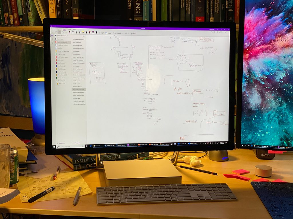
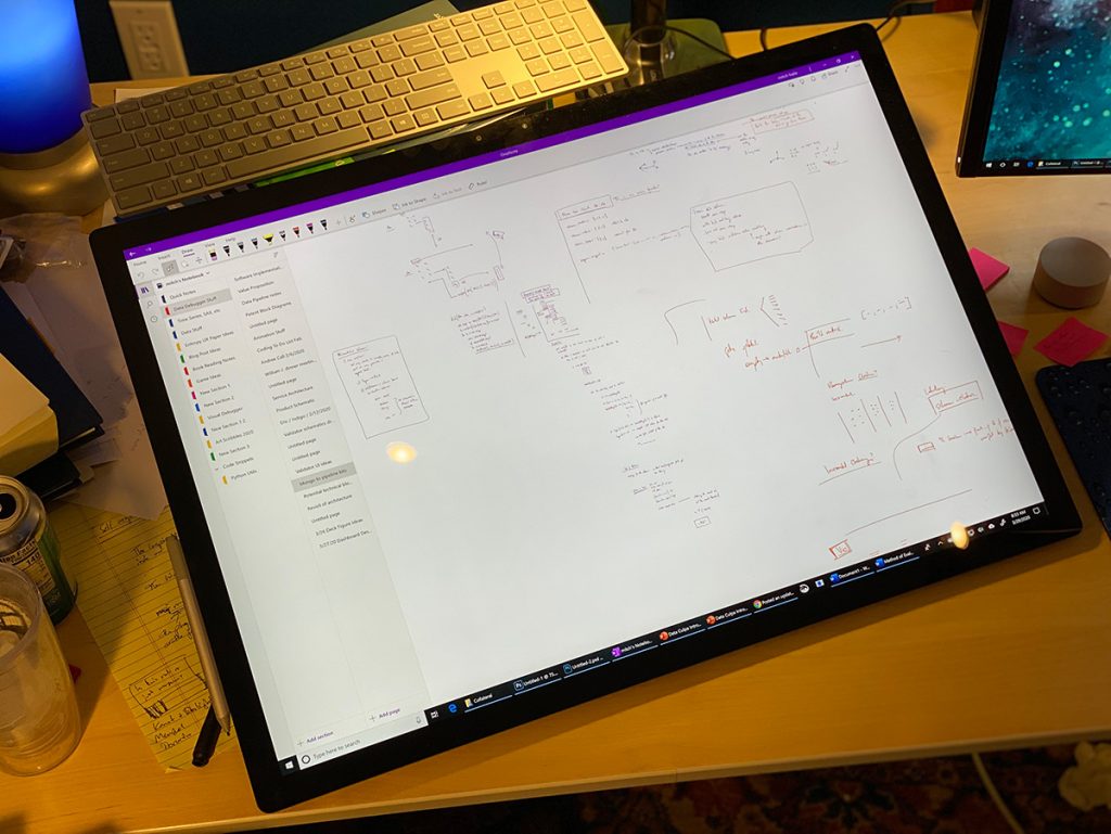
I’ve used the Studio 2 daily for many weeks now to augment my use of paper notebooks. I tend to do most of my thinking work by hand in lab notebooks and there are many limitations with paper: moving a drawing, erasing, undo, and the physical boundaries of paper come to mind. Zooming can also be challenging.

My main project has been working out algorithms and designs for a new set of data processing products. For the past few months, about 75% of what I’d normally do on paper I’ve been doing in OneNote and for the most part, it’s been wonderful. I don’t regret the purchase.

However, there are many aspects of the Studio 2 that are poorly thought out.

  1. The keyboard is an “extended” keyboard with the numeric keypad. However, the use case for the Studio is pen and any extra footprint of the keyboard is just in the way.
  2. The Studio 2 doesn’t come with the Dial, which means it’s pretty much a useless accessory. I bought one and it doesn’t even work with Microsoft’s own OneNote.
  3. The screen doesn’t go high enough on the stand when using it as a desktop. For my desk chair and table configuration, it’s about 4-6″ too low.
  4. When the screen is pulled down, where is one supposed to put the keyboard? There’s an onscreen keyboard, which has gotten better in a recent Windows update, but it’s not ideal. I put a stack of books behind the Studio so I can reach up and use the keyboard. I suspect this is the main reason Apple hasn’t introduced a similar product.
  5. The glossy screen is beautiful. It’s also a mirror.
  6. The computer often struggles to wake up with an external display connected, which means reaching around behind it to disconnect the external screen, wake the computer, and then re-connect it. There’s really no excuse for this.
  7. It’s Windows, which means on random days when I come back to my desk, the computer has updated, rebooted, and all my state is lost. Microsoft continues to fail to understand it is my computer and not their computer; that my tasks are more important to me than their tasks.
  8. USB-C is the only way to connect an external monitor. There’s only one USB-C port.
  9. The pen is a bit thin for my liking; I’d prefer something a smidge thicker. “Put a grip on it,” you said. Yes, but that would prevent the magnetic storage from working (the pen stores on the side of the display).
  10. A few days ago, I finally decided to write up my experience because Photoshop was lagging badly—to the point of being useless, on a small ~3000×4000 pixel document and using the brush tool. I ended up having to reboot the computer to get Photoshop performance back.
  11. OneNote is my main drawing tool, and it sucks in so many ways. (I’m drawing designs and ideas, making notes and thinking, not making art.) Export sucks, printing sucks, there’s no layer tool, etc.

I don’t regret the purchase; I’ve been far more creative at a higher velocity in my work with it. I’d say it’s still $1,000 too expensive for what it is, and a premium drawing tablet should come with 32 GB of RAM standard.
When Microsoft comes out with a newer model, I may upgrade.

Tags:

Back to the Stacks

Posted by mitch on October 03, 2019
hardware

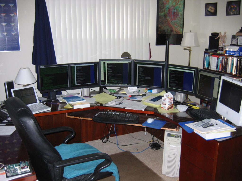
Around 2004, when flatscreens were starting to come down in price, I embarked on an adventure. I bought a mixture of 17″ and 19″ panels–8 of them–and some Ergotron DS100 quad screen stands to try stacked monitors. You might recall a 17″ panel was 1280×1024, a 5:4 aspect ratio, and large enough for essentially one window of code. With a mix of terminal windows and code buffers, I wanted to have ~4 buffers on the bottom row and a mix of terminal windows and header files on the top row.

I never really took a good picture of the setup, but the net-net was that it didn’t work very well. The second row was overwhelming; it gave me headaches, and I felt like the world was bearing down on me. It was disappointing, but I continued to use my screens in a single row horizontally in a variety of configurations. Typically I had 4-6 displays on my main coding machine, and an extra display or two for iTunes, documentation, whatrever on adjacent computers.

2005 era office in Cupertino, CA.

In 2007, I started living in Boston part-time and bought a 24″ 1920×1200 screen in Boston and I quickly bought a second one for my home in California. I had been wary after the headache-setup of trying larger screens than 19″, but once I was stuck with coding on a laptop that I carried back and forth, I wanted the biggest screen possible–and it turned out to be fantastic. In June 2007, I consolidated my life to Boston and ended up running two 24″ with two of my 17″ panels in portrait mode on either side. I would use a large window stretched across the screens and 2 buffers per 24″ screen with terminals on the 17″ panels.

In 2008, Apple “finally” released an updated Mac Pro (the wait seemed long at the time–but nothing like Apple’s pace these days). I bought my first Cinema 30″ screen around that time and the sheer wonder of 2560×1600 and all it could do was not lost on me. I quickly bought another three or four 30″ screens and some 20″ screens that I ran in portrait mode.

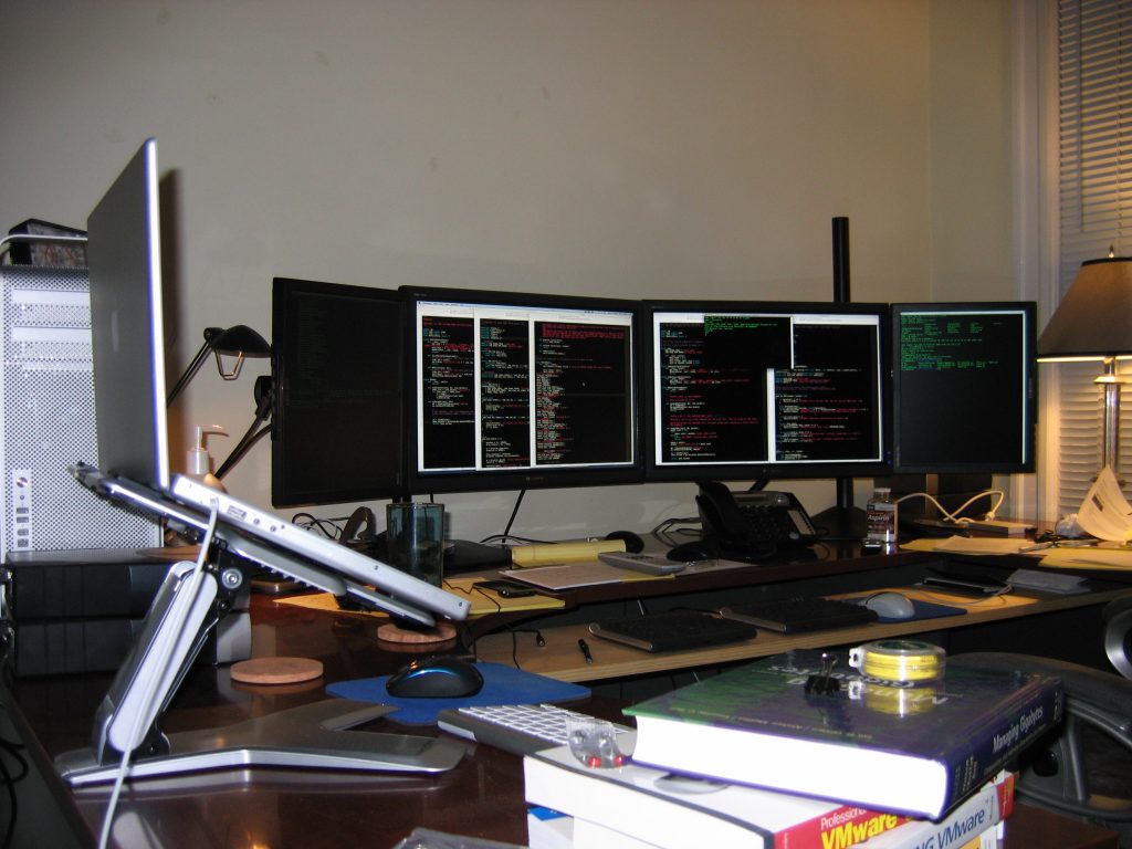
January-ish 2008: 2×24 + 2×17

The Apple screens used a fluorescent bulb. These don’t last forever and by 2014, I had upgraded to 3×30″ HP screens, as the Apples were getting too dark. The HPs I bought were the last pre-LED backlight 30″s that HP sold, unfortunately, but they held up well–and they used DisplayPort and didn’t require all the power bricks and dongles that the Apples did. I sold all the Apples on Craigslist.

In 2016, Dell released the 43″ 4K screen and I ordered one the day they announced it while waiting for take off on an airplane. I eventually began running the 43″ with new LED-backlit 24″ screens in portrait and picked up a second 43″ ViewSonic screen for my secondary coding workstation.

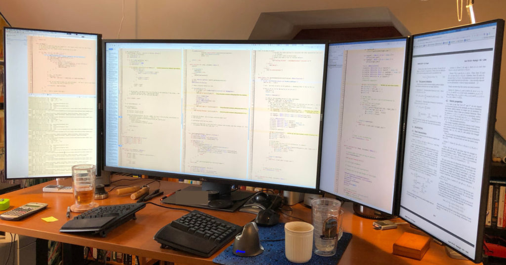
A few months ago, for some reason, I started wondering about stacked displays again. I was dubious but found some tall monitor arms–it was challenging to find arms tall enough that the 24″s would clear the height of the 43″ displays, and I finally upgraded my 43″ screens to be mounted on monitor arms (an Ergotron HX for the Dell and a now-discontinued HumanScale M8 for the ViewSonic, due to the terrible VESA mounting position on the ViewSonic–the Ergotron arm isn’t tall enough to mount the ViewSonic).

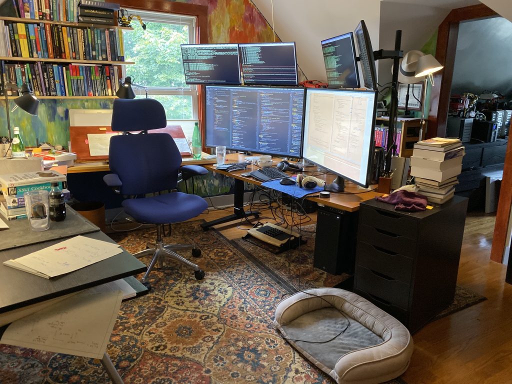
Current: 2×43 + 4×24

After a few months of use, I’m happy to say it’s been a wonderful experience. I have room for two huge development windows with 3-4 buffers each across the bottom, and all my remote shells, logs, Slack up above. The 43″ screens are big enough that I don’t see the 24″ monitors unless I want to look up at them. I suspect the fact the screens are all LED helps as well–and I’m much more aggressive about using giant fonts than I was 15 years ago (my vision is still good enough not to need correction, but no reason to push it).

I put the tall arms into existing grommet holes on my desktop, which turned out to provide some separation between the left/right pair, which seems to be fine for how I work with them.
All six are connected to my 2013 Mac Pro. Five are connected via DisplayPort and one of the 24″s via HDMI, since my sixth Thunderbolt port has some hard drive arrays hanging off it.

The issues I’ve blogged about before still exist: I wish for curved 43″-caliber displays; I have owned the Dell 38″ curved, and while it’s very nice–a much higher quality screen than the Dell 43″–the height is too short after having lived with the 43″ height for so long.

I’ve written about 20,000 lines of code in the last few months while working at this set-up on products with a significant number of moving parts. It’s just been awesome. If you haven’t tried stacking screens, it could be a good move.

Big Monitors Compared

Posted by mitch on August 31, 2018
hardware

For the last 18 months or so, 43″ displays have been the max you can get for a traditional computer monitor on the desktop. Dell was the first, and I ordered their 43″ the day they allowed pre-orders in May 2016; other vendors eventually followed.

During the last 18 months, I’ve collected the Dell 43, the curved Dell 38, and a ViewSonic 43. Which one is the “best”? Let’s take a look:

First, overall, these are 4K screens with pre-HiDPI/Retina resolutions. The 43″s run around 100 pixels per inch, which is about the same as the old 30″ monitors that were 2560×1600. I really like this resolution, but of course it will be great to upgrade to 8K in a few years for the increased sharpness.

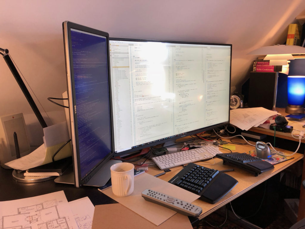
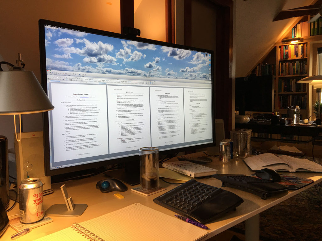
Here’s my main desk, with three portrait screens and the Dell 43″ in the middle:

The Dell 43″: Plenty of inputs. The speakers are OK, but not great. DisplayPort and HDMI only; no USB-C. The buttons are on the front. Color reproduction is adequate for non-color work but definitely not good enough if you’re doing anything serious. The DisplayPort handshake can be iffy with MacOS from time to time (10.13.6 is worse than 10.13.5 was, but 10.13.x has been better than 10.12.x).

The main drawback is a dark gray band around the perimeter of the screen. It’s annoying once you notice it; I didn’t notice it til someone else who bought the monitor asked if I had noticed it. (Thanks a lot! :-).

The ViewSonic 43″: Like the Dell 43″, it lacks USB-C. The control buttons are on the back and overthought–someone thought you’d like to reach around and get angry to turn on the monitor or use a weird joystick… it’s quite odd. The color is very nice–much better than the Dell, but the screen has a slightly glossy coating, which means reflections can be quite bad on dark backgrounds.

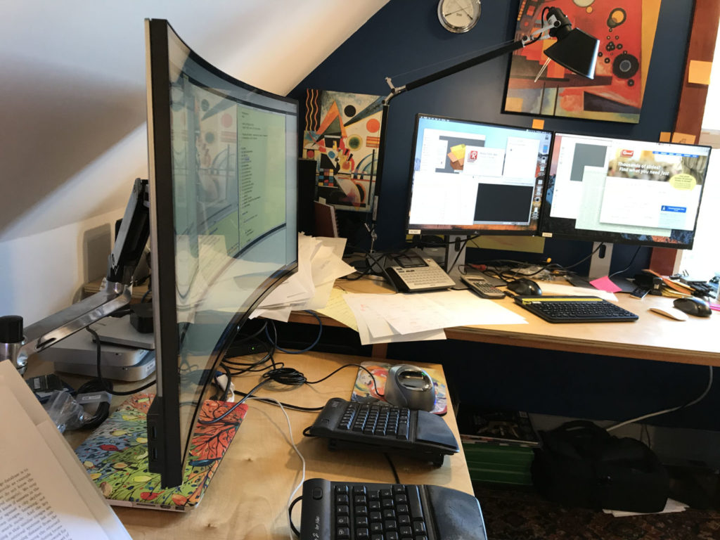
The Dell 38″: One of the downsides with both of the 43″ panels is that they are not curved; I sit about 21″ from the screen in the middle, which means the distance from my eyes to the corners of the screen is about 6″ further away. A curved 43″ would be very nice, and so it turns out the curved 38″ is very nice too. It’s almost as wide, the color is good, and it has USB-C. However… the 1600px height kills it for me. Sure, this is what I had on 30″ displays for years, but once I went to a 2160px tall screen, losing those 500 pixels suddenly matters. The screen is much shorter in height, as well, which is why I’ve decided to sell my 38″. But if you need USB-C, this is a great buy.

Here’s a view of the Dell 38″‘s curve:

Monitor arms

One thing to keep in mind with these bigger monitors: If you want to use a monitor arm, the 43″s are big, heavy and may need a 200×200 plate–the bigger arms can cost quite a bit more. I used the 38″ on a modern Ergotron LX arm and it was fine. Ergotron makes a HX series, but I haven’t tried that arm yet.

Where does that leave us?
It’s hard to say. The 38″ costs more, but is probably the best overall screen. If you can deal with the gloss, I’d say the Viewsonic 43″ comes in slightly ahead of the Dell 43″, and is probably the best value for the buck.

Tags:

The Dell 43″ 4K monitor

Posted by mitch on June 05, 2016
hardware

I was sitting on a plane on May 20th waiting to take off back home to Boston when I read about Dell’s release of the P4317Q, a 43″ 3840×2160 monster. I managed to order it before we got in the air.

I had been running the Dell 34″ curved monitor with a 27″ in portrait. The wideness of the 34″ was fantastic–it’s easy to see 3 pages of text side by side by side. However, the 34″ was frustrating for Xcode work–the 1440 height isn’t ideal for most of my work vs the standard 1600 pixel height of 30″ displays. Although I’ve sold off my original 3×30 Apple displays, I still have and use 3 HP 30″ displays, 2 in one office and 1 in another office.

But mostly I just want the biggest workspace possible, and Dell has finally delivered a big workspace. The 43″ runs about 104 pixels per inch, which is comparable to the 30″ 2560×1600 of roughly 100 pixels per inch. This means there’s not a “Retina”-style HiDPI tightness to text, but instead a larger viewing area.

Initially I got extremely motion sick from the monitor–It turned out my Gunnar computer glasses were making me sick with this large display. The motion sickness happened within 5 minutes.

Since taking them off and spending about 20 hours with the monitor, I’ve found it’s almost exactly what you’d expect–a beautiful, expansive, stunning display with one major caveat: It’s not curved, which means the corners of the screen are about 7″ further away from my eyes than the middle of the screen. Hopefully a curved version is coming. A smaller challenge is that the top of the screen is “too high” if I slouch in my chair–I think the monitor actually works better when my standing desk is elevated, but this is relatively minor.

I tried to take some pictures to capture how big this screen is, but nothing really pulls it off. Below is a picture showing a 4 page Word doc at 150% Zoom–the pages are slightly larger on the screen than printed. Without tool bars, it’s quite possible to squeeze in almost 8 pages on the screen in a 4×2 grid without much reduction in size.

If you have room for it, are tired of bezels breaking up the view, this could be a good way to go. I’ll definitely upgrade when someone comes out with a curved version or something even wider–I’d love to have a 50″ curved display, perhaps on the order of 5440×2160.

IMG_1835

Tags: , ,

What’s the deal with printers?

Posted by mitch on May 25, 2015
hardware, productivity

In 2001, Lexmark offered a PostScript USB printer for $399. No networking, but laser! For under $400!

I bought it. The printer couldn’t print straight (the paper tray was poorly designed), but it was laser! For under $400! On my desk! And it worked with lpd, which meant all of my computers could print (but not parallel to the edges of the page). Data Domain, in 2002 and 2003, actually had two of these same Lexmarks, slightly newer with some tweaks that seemed to fix the paper tray issue.

By about 2004 or 2005, Lexmark had a new personal laser printer, which I picked up for about $280. It could print straight and it was fast. Great printer.

In 2007, I moved to Boston and gave that printer away and bought a Canon all-in-one. It could scan to email or USB stick and create PDFs, photocopy, etc–it was fantastic and it was only $400 or so. Except that the fonts and text quality were quite bad, but other than that…

In 2009, I was preparing for and stressing over a set of presentations with millions of dollars on the line. I was worried about printing slides and bought a color Lexmark laser printer, I think for about $500. I printed my slides (50 pages or so) and didn’t use the printer for about 13 months. When I went to use it again, it had some internal error that apparently meant the printer was now a large boat anchor. I had kept the Canon and just kept using it.

In 2012, I had a job interview. I took my résumé printed on that Canon printer with me. I was so embarrassed at the text quality, I didn’t hand it to the interviewer. On my way home, I bought a beefy Brother color laser printer and eventually added the second paper tray and upgraded the RAM to 384 MB. The print quality for graphics was good (not great), and for text it was awesome. The Brother system cost me about $650.

The only issue with the Brother was that it often could take 2-5 minutes to warm up before printing. So if I was on the phone and wanted to print something and write down notes, the call could be well on its way by the time I got my document out of the printer. The other issue was that the Brother was a printer only and the Canon was getting long in the tooth–5 years of poor quality copies, no support for TLS-protected emails made it difficult to use for scanning–it was time to upgrade.

So I bought a monster HP color laser all-in-one with the huge extra paper tray and rolling stand. It cost about $1500 all told. When I printed a color document and compared it to the Brother, I was blown away–the HP graphics are just awesome. It can print 30 pages before the Brother wakes up to start printing 1. (No kidding!) It works with the Mac Image Capture app for both the flatbed scanner and the document feeder.

But… the HP doesn’t reliably wake from sleep over the LAN. It has issues with Chome and PDFs from time to time. The paper tray design is the opposite of what I want–it can hold 250 8.5×11 sheets and 500 8.5×14. I want 250 8.5×14 and 500 8.5×11. Seriously HP, get it together. Its 256 MB of RAM isn’t upgradeable (unreal, I couldn’t believe that). I’ve ended up stringing a USB cable across the office temporarily, since the networking doesn’t work (essentially).

During this time, due to the cost of the HP color toner, I bought a $150 Brother laser for my family to use. It’s black and white, takes up minimal space, it’s fast as heck, uses little electricity, and the text quality is better than the Canon–it’s a great little printer! I kind of want one for my office! But of course, no color, copier, or alternative paper trays.

Let’s review the issues for a device that is supposed to print:

  1. Doesn’t print straight [Lexmark #1]
  2. Poor text quality from a b&w printer [Canon]
  3. Total cost of ownership was $10/page, then required to throw away 60 lb of metal and plastic [Lexmark #2]
  4. 2-5 minutes to warm up! [Brother #1]
  5. Unreliable networking on a workgroup printer, stupid paper tray design, etc. [HP]

Is this so hard? I’ve bought 7 laser printers in the last 15 years and only 2 of them seemed to be good…and they were at the bottom of the market. It makes no sense and it’s frustrating.

Your Data Center Will Be Smaller Than Your Childhood Bedroom

Posted by mitch on May 19, 2015
business, hardware, software

I saw a tweet from Chris Mellor referencing a Gartner conclusion that mid-market IT will go to the cloud:

Today, Storage Newsletter‘s headline quotes an IDC report that personal and low-end storage sales (less than 12 bays) have declined 6.4% y/y. Some dimensions of the business sank 20% y/y.

What happened in the last year? Do people create less data than they did a year ago? Isn’t data storage growing tremendously?

What is changing is where people create and keep their data. As applications move to the cloud, the data goes with it. From Salesforce to consumer photos, from corporate email to songs, all of this stuff is in someone else’s data center.

I have about 100 TB of disks in my house across six fast hardware RAIDs, but all of my critical working set lives in the cloud. The cloud pricing for large amounts of data (e.g., 1 TB) is so cheap that it’s free or bundled (Office 365, Flickr). Dropbox stands alone as an outlier to a priced service and it’s not that expensive–certainly I cannot buy a 1 TB drive and operate it for 1 year at the price point that Dropbox offers.

Generally, IT vendors fail to deliver on simplicity; it’s not in their vocabulary. I’ve been in those meetings–hundreds of them, actually–where engineers want to offer every option for the customer and for some reason (lack of vision?) the product manager lets it happen. The problem with these meetings is that everyone in them usually forgets that while the product is the most important thing in the lives of the folks creating the products, the customers have other things on their minds.

So we end up with these overly complex IT products that are impossible to use. Quick, how do you set up Postgres database backups with Tivoli? I have no idea but I know it will take a few hours to figure it out (if I am lucky). The brilliance of Amazon’s cloud user interface is that (1) the details are hidden and (2) the user is presented with just the critical options. Do you want to back up this database? Sure! Great, when? Hey, you know, I don’t really care. Just keep the backups for 30 days.

aws-screenshot

One of the most powerful things about AWS is that significant infrastructure is under a single pane of glass. This has been the Holy Grail of IT but never realized. OpenView, System Center, vCenter, TSM–everyone wants to do it, but few organizations pull it off, likely due to a mix of political, technical, and economical reasons.

The best part of Gmail going down is that it’s not my problem to bring it back online. Remember when you worked at a place that ran Exchange and the guy in charge of Exchange was always on edge? The only reason that guy is on edge now is that he is waiting for a call to see if he got the job at a place that has switched to Gmail.

The data center of the future for most mid-market companies is a single rack consisting of network connectivity, security devices, and WAN acceleration devices. No servers or standalone storage–with applications in the cloud, the only thing needed locally is data caching to augment the WAN overhead and maybe provide short-circuit data movement among local peers. This single rack will fit into a closet.

IT will still exist; these cloud applications will still need support, maintenance, and integration–and the network issues will be as challenging as ever.

But anyone who is building IT products for on-site installation is facing a significant headwind if you’re not enabling the cloud.

Tags:

The New Mac Pro @ 8 months

Posted by mitch on August 03, 2014
hardware

I ordered my 2013 Mac Pro the day they went up for sale, even though I had an early morning flight that day. To recap, I bought a 6 core with D500, 1 TB SSD, and upgraded to 64 GB of OWC RAM. I upgraded my old 8 TB Areca RAID to 24 TB, bought an OWC Thunderbolt PCI chassis, and moved over my (old) Areca 1680x card. The OWC chassis is loud, so I also bought the 10 meter Thunderbolt cable and put the adapter box and disks in my office closet.

I had been running 3×30″ Apple displays with the cable mess that comes with the DisplayPort->DVI adapters, but recently switched out the Apple displays for my HP ZR30ws. Frankly, the HPs have a better picture, likely just due to crisper, more even lighting as a result of being 6 months old instead of 6 yrs old, but best of all, they require no adapters.

I sold my 2012 12-core Mac on Craigslist.

The highlights of the new Mac Pro are the lowered energy usage, the reclaimed physical space, and the huge reduction of cable mess. It’s disappointing going to 128 GB of RAM comes at a huge memory speed hit in the new box, but I can live with it (hoping that something better will be available by the time I need more than 64 GB).

The new Mac has only been off for about 2 days since I bought it, due to construction in my office. It’s been solid. I’m happy with the upgrade.

(I didn’t mention performance! It’s fast. The old box was fast, too. Is this one faster? Go look at my other post. I am spending most of my time crunching numbers in C++ on Linux this year, and it’s been great–especially with the 3.5 ghz single thread vs 2.4 ghz for the old 12-core–but 64 GB has been an issue for some of the calculations I am doing. But not a show stopper yet.)

The only downside that has bitten me is that there’s no locking mechanism for Thunderbolt cables–so if one falls out, and your home directory is on that Thunderbolt device (mine is), it’s very unfortunate. I’ve “solved” this with zip ties for now.

Mac Pro

Tags:

Scribbles on the New Mac Pro

Posted by mitch on January 26, 2014
hardware

A significant number of folks have asked about my thoughts on the new Mac Pro… so here we go. I promise not to tell you the same nonsense you have already read everywhere else (lighted ports, etc.).

Some background: I bought an 8-core 2008 Mac Pro on the day they were available for pre-order. It was my main workstation for years, until September 2012, when the speed and RAM ceiling became painful enough to upgrade to the “2012” Mac Pro, a 12 core 2.4 GHz machine. Clock for clock, that upgrade yielded compute performance roughly double the 2008 Mac Pro.

I wasn’t sure what to expect with that upgrade, nor was I sure what to expect with the new 2013 Mac Pro. Because of price, I elected to try a 6-core machine with the D500 video, 1 TB flash, and 64 GB of OWC RAM.

I recently ran some performance tests to see how things are going with the types of computing I do. One test is a unit test of some code I am writing. The code talks to several VMs on a third Dell VMware ESXi box and spends most of its time in select() loops. There was almost no performance difference between the old and new Macs–about 3%, which isn’t surprising.

However, I have some code that runs on local disk and does heavier CPU work. One of the pieces of code shoves a lot of data through a commercial database package inside of a VM. The VM is configured with 8 cores and 16 GB of RAM on both machines. We’ll call this Test A.

Another test does extensive CPU calculations on a multi-gigabyte dataset. The dataset is read once, computations are done and correlated. This runs on native hardware and not inside of a VM. We’ll call this Test B.

old Mac Pro1 new Mac Pro2 Retina 13″ MacBook Pro3
Test A: 65.6 seconds 38.1 seconds N/A (not enough RAM)
Test B: 82.3 seconds 52.9 seconds 67.8 seconds

1 2012 Mac Pro, 12-core 2.4 GHz, 64 GB of RAM, OWC PCIe flash
2 2013 Mac Pro, 6-core 3.5 GHz, 64 GB of RAM, Apple flash
3 2013 Retina MacBook Pro 13″, 2-core 3 GHz i7, 8 GB of RAM, Apple flash

As you can see, the new Mac does the same work in about 40% less time. The CPU work here is in the range of 1-3 cores; it doesn’t scale up to use all the available cores. To keep the tests as fair as possible, the old Mac Pro is booting from a 4-SSD RAID 0+1 and the test data lived on a OWC PCIe flash card. None of these utilize the GPUs of the old or new Macs in any fashion, nor is the code particularly optimized one way or the other. I ran the tests 3 times per machine and flushed the buffer caches before each run.

Does the Mac feel faster day to day? Maybe. In applications like Aperture, where I have 30,000 photos, scrolling and manipulation “seems” a heck of a lot better. (For reference, the old Mac has the Sapphire 3 GB 7950 Mac card. I don’t have an original Radeon 5770 to test with, having sold it.)

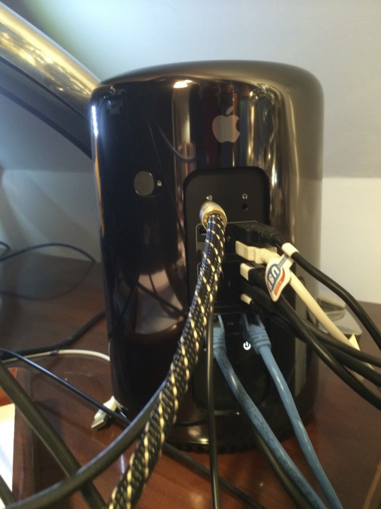
The cable mess behind the new Mac is the same as the old Mac. In fact, it’s really Apple’s active DVI adapters for my old Apple monitors that contribute to most of the cable mess. Once the Apple monitors start to die, that mess will go away, but until then I see little reason to upgrade.

The physical space of the new Mac pro is a significant advantage. The old Pro uses 4 sq ft of floor space w/ its external disk array. The new Pro by itself actually consumes a footprint smaller than a Mac Mini (see photo at end of this post)!

The fan is quiet, even under heavy CPU load. The top surface seems to range from 110 F — 130 F; the old Mac has a surface exhaust range from 95 — 99 F at the time I measured it. So it’s hotter to the touch, and indeed the sides of the chassis range from 91 F at the very bottom to about 96 F on average. For reference, the top of my closed Retina MacBook at the time I’m writing this is about 90 F and the metal surface of the 30″ Cinema display runs around 88 F to 90 F in my measurements (all measured with an IR non-contact thermometer).

Because there is no “front” of the new Mac Pro, you can turn it at any angle that reduces cable mess without feeling like you’ve got it out of alignment with, say, the edge of a desk. This turns out to be useful if you’re a bit particular about such things.

On storage expansion, there’s been a lot of concern about the lack of putting drives into the new Pro. Frankly, I ran my 2008 machine without any internal disks for years, instead using an Areca 1680x SAS RAID. I’m glad to see this change. There’s lots of consumer-level RAIDs out there under $1000, but I’ve given up on using them–performance is poor and integrity is often questionable.

I am backing up to a pair of 18 TB Thunderbolt Pegasus systems connected to a Mini in my basement, and bought an Areca ARC-8050 Thunderbolt RAID 8-Bay enclosure and put in 24 TB of disks for the new Pro. Sadly, while it’s fine in a closet or basement, it turns out to be too loud to sit on a desk, so I bit the bullet and ordered a 10 meter Thunderbolt cable. I haven’t received the cable yet, so I haven’t moved my data off my Areca SAS RAID in my old Pro yet. But once that is done, I expect to stop using the old 8 TB SAS RAID and just use the new RAID. These are expensive storage options, but the cheap stuff is even more expensive when it fails.

So, should you buy the new Mac Pro?

I don’t know.

For me, buying this Pro was never about upgrading from my old Pro, but rather upgrading my second workstation–a maxed out 2012 Mac Mini that struggled to drive 30″ displays and crashed regularly while doing so (it’s stable with smaller displays, but in the sample size of four or five Minis I’ve had over the years, none of them could reliably drive a 30″–Apple should really not pretend that they can). In the tests above, I’ve ignored the 900 MHz clock difference, but clearly that contributes to the performance for these kinds of tests.

What about price? This new Mac Pro ran me about $6100 with tax, shipping, and the OWC RAM upgrade. The old Mac Pro cost about $6300 for the system, PCIe flash, SSDs, brackets, video card upgrade, and OWC RAM upgrade. (The disk systems are essential to either Mac as a main workstation, but also about the same price as each other.) I don’t view the new Mac Pro as materially different in price. Pretty much every main workstation I’ve had in the last 12 yrs has run into the low five-figures. In the grand scheme of things, it’s still cheaper than, say, premium kitchen appliances, though perhaps it doesn’t last as long! On the other hand, I’m not good enough at cooking that my kitchen appliances are tools that enable income. If I wasn’t using my Macs to make money, I doubt I’d be buying such costly machines.

While I am not a video editor, and just do some 3d modeling for fun as part of furniture design or remodeling projects, I feel this machine is warranted for my use in heavy CPU work and/or a desire for a lot of monitors. I’m not in the target GPU-compute market (yet?), but I do want a big workspace. There’s no other Mac that offers this (I get headaches from the glossy displays Apple offers, though the smaller laptops screens are ok).

So now on my desk, I have a pair of Pros, each driving a set 3×30″ displays, which matches the work I am doing right now. I haven’t had a video lock up for 12 days and counting, which has proven a huge time saver and frustration reducer, so I’m happy that I jumped on this earlier than later.

Tags: , , ,

30 Years of Mac

Posted by mitch on January 24, 2014
hardware

My parents bought a Mac 128K in 1984 (pictured below). The screen stopped working in 1993, and it hadn’t been reliable at that point for a number of years–my dad upgraded to a pair of Mac Pluses when they came out and then later he upgraded again to the Mac II.

There were lots of frustrating things about the Mac 128. Almost no software worked on it, since it was outdated almost immediately with the Mac 512. MacWrite didn’t have a spell check or much of anything else. Only one program could run at a time–no Multi-Finder. A 1mb Mac Plus was a significantly better computer, especially if you had an external hard disk that conveniently fit under the Mac–thus increasing speed, storage capacity, and the height of the monitor. Even the headphone port on the 128 was mono, if I recall correctly.

Yet there was something deeply magical about computing in that era. I spent hours goofing off in MacDraw and MS Basic. At one point, my dad had the system “maxed out” with an Apple 300 baud modem, an external floppy drive, and the ImageWriter I printer. At some point, the modem went away and we were modemless for a number of years, but one day he brought home an extra 1200 baud modem he had at his office and I spent hours sorting out the Hayes AT command set to get it to work–a lot of registers had to be set on that modem; it wasn’t just a simple matter of ATDT555-1212.

That reminds me, I need to call Comcast. It seems that they cut their pricing on 100 Mbit connections.

Tags:

The New Mac Pro

Posted by mitch on June 11, 2013
hardware

I am very excited about the new Mac Pro.

We don’t know the price yet. We don’t have full specifications. It’s not clear this form factor will ever support dual CPU packages or 8 DIMM slots (it seems it might only have 4 sockets). The total price for four 32 GB DIMMs currently runs about $10,000 from B&H. Happily, four 16 GB DIMMs is a lot less—around $1,200. 64 GB of RAM is sufficient for me for now, but I am looking to see a 128 GB option for around $1,200 within two years of owning the machine based on how my need for memory has grown in the past.

Apple does claim an I/O throughput on flash to be around 1250 MB/s, which is better than my RAID 1+0 four disk SATA SSD RAID in my Mac Pro and faster than my first-generation PCIe Accelsior OWC card.

Apple mentions up to 2×6 GB of dedicated video RAM, which significantly beats the 1-3 GB cards we’ve had on the market until now. I also am excited at the prospect of 30″ displays at 3840 x 2160. My three Apple 30″ displays are starting to show their age in terms of the backlight wear—it takes longer and longer for them to come to full brightness. I bought a Dell 30″ for my other desk, and I had to buy a calibrator to get acceptable color out of it. So I am hopeful Apple will ship a matte 30″ 4K display… (this seems rather unlikely).

Only four USB ports is a shame, but not the end of the world. Hopefully the USB 3 hub issues with Macs will be resolved soon.

And then there are the PCI slots. My Mac Pro currently has a 7950 video card in one slot, an Areca 1680x, an eSATA card that I quit using, and the PCIe Accelsior. Frankly, the new Mac Pro meets my PCI expansion needs—external chasses are cheap if I ever really need slots (just $980 for a 3 slot Magma; and Apple mentions expansion chasses are supported). What makes this possible is that Thunderbolt RAIDs are just as fast as Areca SAS configurations and generally require a lot less monkeying around. I have two Promise 18 TB Thunderbolt RAIDs connected to a Mac Mini in my basement for Time Machine backups and they have been fantastic.

So I imagine my 2013 Mac Pro will look like the following configuration:

  • Mac Pro with 8 or 12 cores, depending on price and clock options
  • 64 GB of RAM
  • 512 GB — 1 TB flash storage for boot
  • Thunderbolt ports 1-3 — with DisplayPort adapters for existing displays
  • Thunderbolt port 4 — 12-24 TB Thunderbolt RAID for home directory. I’d love to see a 12×2.5″ SSD RAID 1+0 when 1 TB SSDs get under the $400 price point.
  • 3 USB ports connected to hubs
  • 1 USB port connected to external hard disk for cloning boot drive to
  • Hopefully the audio out line has an optical connection like the AirPort Express and other optical products.

I think this will fit my needs pretty well, as long as a 128 GB RAM upgrade is cheap enough down the line. 256 GB would have been a lot nicer.

And best of all, this configuration will free up at least 4 sq ft of floor space where my Mac Pro and SAS chassis sit. If the computer is quiet enough to sit on the desk, then both the Mac Pro and the Thunderbolt RAID only take up about 1.5 sq ft of room, which would be a tremendous improvement in my office where space is a premium.

Update: I take issue with the complainers who say that the new Mac Pro will lead to a big cable mess. For me, I expect it will be about the same, but take up less floor space:

Tags: ,