I resisted writing this post as long as I could. I really did. I’ve always been so excited about Drobo and everything they were doing to enable anyone to have the benefits of redundant blocks in a storage system. I was super excited when Drobo started going up-market with the introduction of the Drobo Pro a few years ago and later the Drobo Elite. It was going to be an exciting ride to see where Drobo took things.
Recently I made the mistake of upgrading to the new Drobo Dashboard, the management tool for monitoring one or more Drobo boxes. I was struggling to get my Mac Pro to see my Drobo after installing an SSD and pulling in a recovered OS configuration.
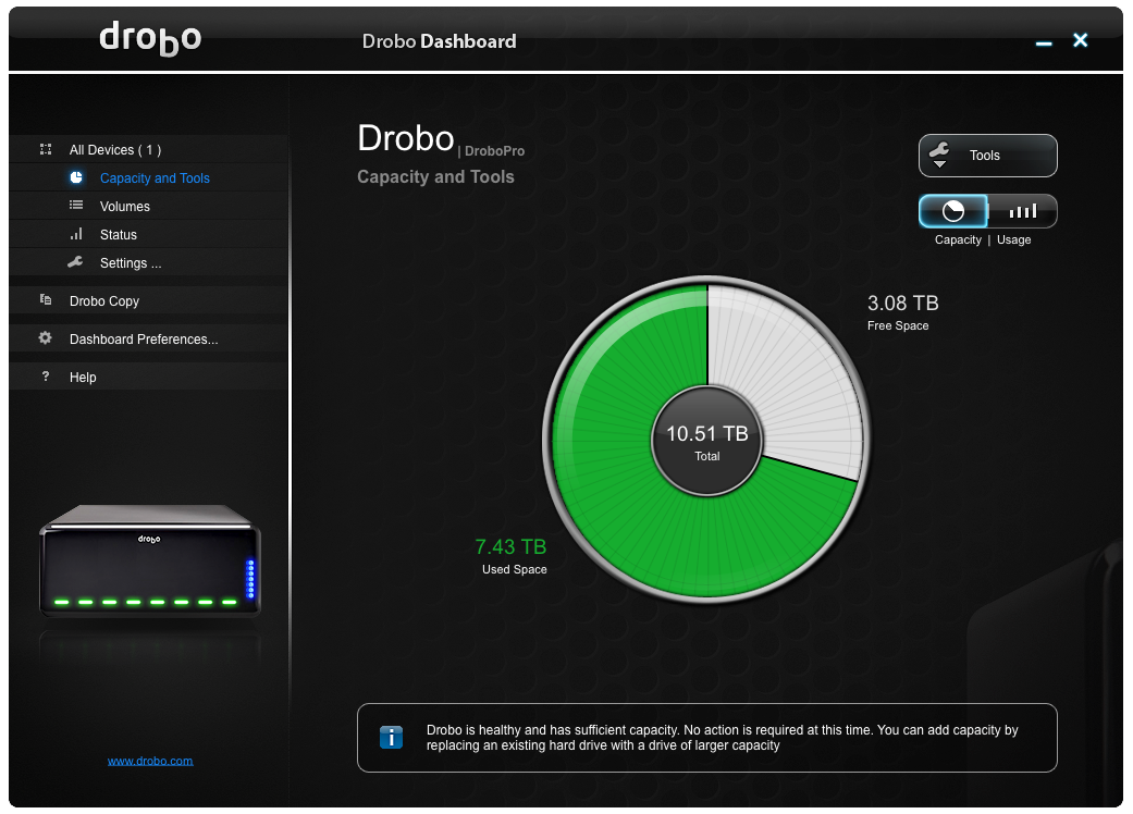
In any event, I ended up with the new Drobo Dashboard. You can tell it was designed by the marketing department because the Drobo name and logo appear at least 8 times in this screenshot. Do you think this reflects the voice of the customer? “Your UI is great, but I really wish you had the name of your company up on the screen in more places. One or two is just not enough!”
There are other problems with the look of this interface, of course–I have no other apps that look like this or behave like this (fact), it’s ugly (opinion), it’s hard to read (fact: white text on a black background is a bad idea)…. I could go on, but it’s too painful and frankly I feel bad. I’ve pumped out my share of bad user interfaces over the years, but none of them had the vendor name on them in 8 places in a single view.
